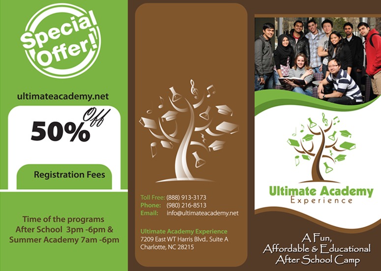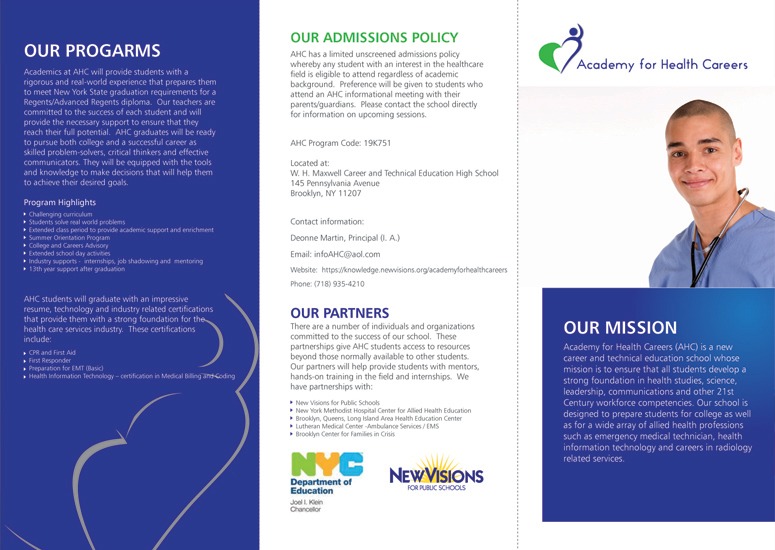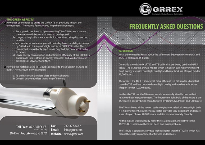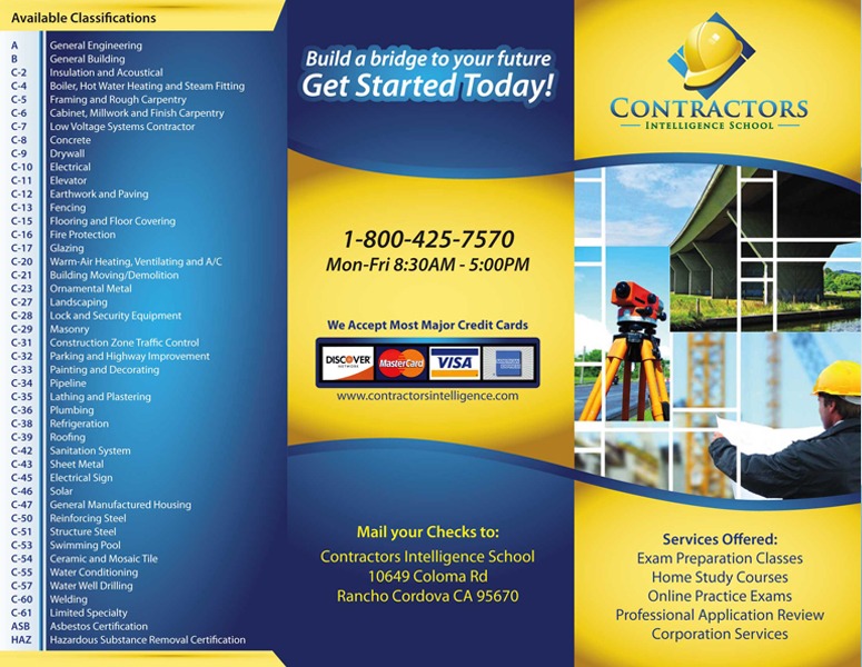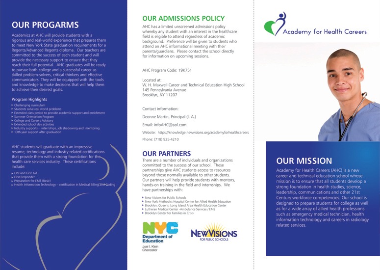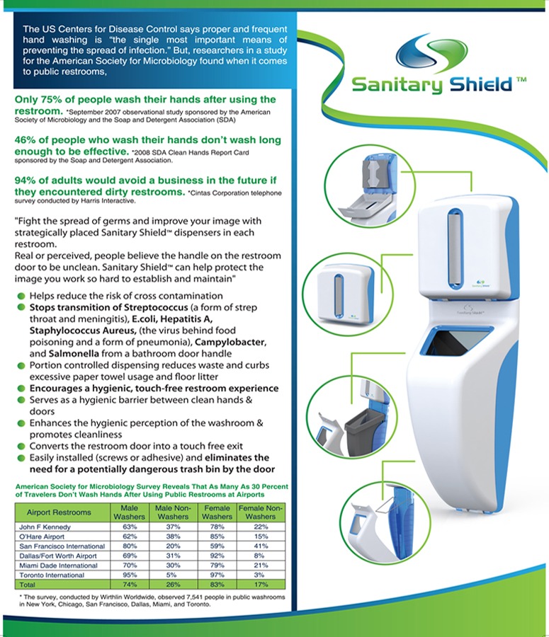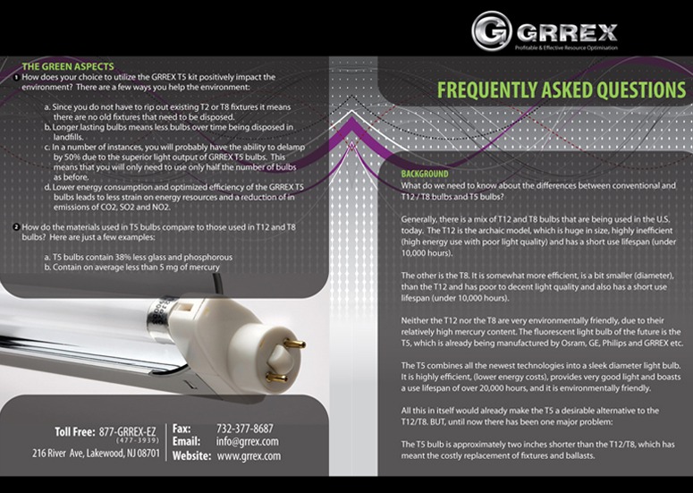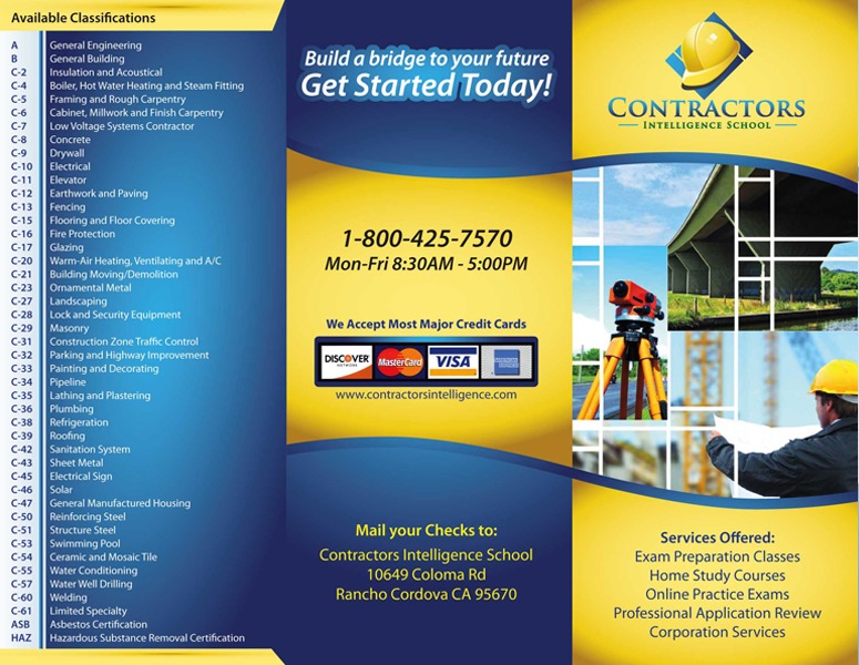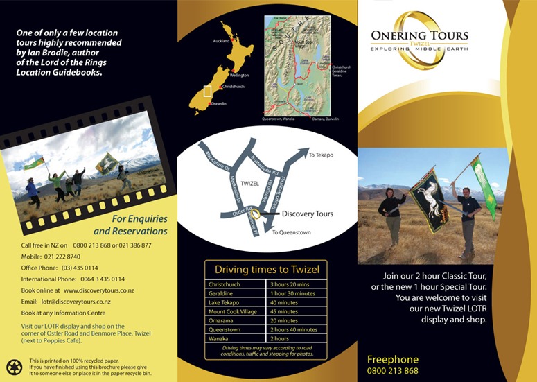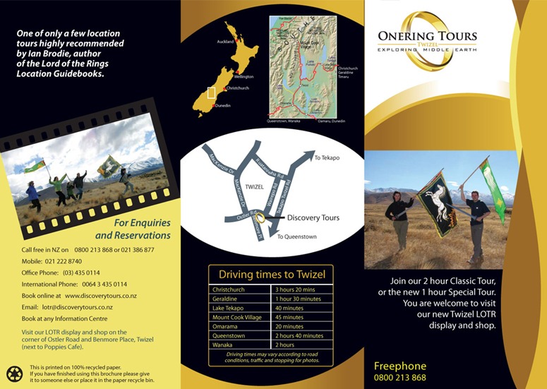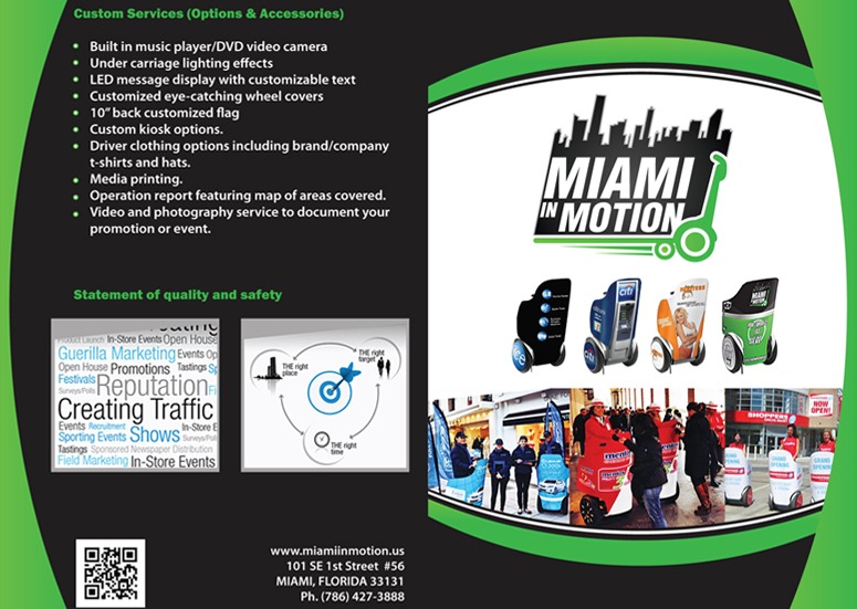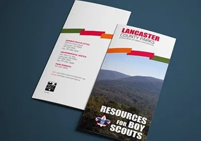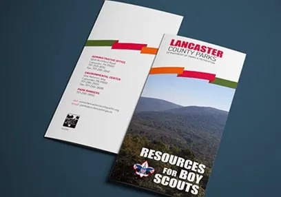

Making a Lasting Impression of your Brand by Captivating Brochure Designs
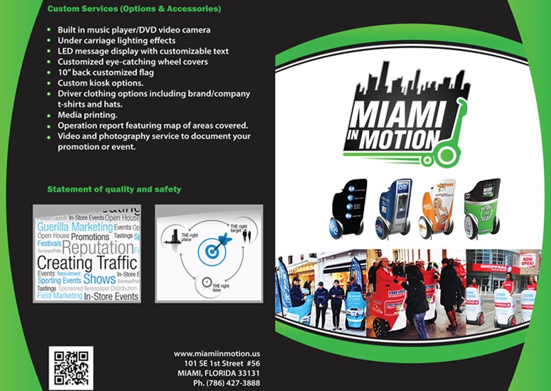
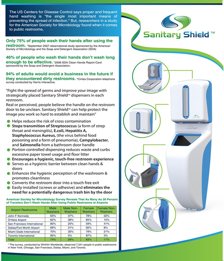
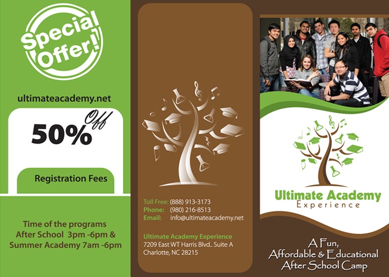
An attractive leaflet and brochure design can generate new leads, increase sales, and raise brand awareness. HR Design provides one of the best brochure and leaflet design services in the UK.
The brochure design service is perfect if you are looking for creative graphic design to promote your business. You can use the brochure design for all kinds of events, for example for special offers or sales.
Skip the buzzwords and get straight to the point with a clean, clear brochure design. We are a professional graphic design service provider, offering creative and innovative design solutions for all your brochure and leaflet design needs. Our brochure and leaflet design service offer a bespoke solution to your business’ marketing communication needs. We’re experts in creating high-quality, eye-catching designs that get results.
Our Packages
SINGLE SIDE LEAFLET
-
01 Single Side Leaflet
-
01 Stock Photo
-
Unlimited Revision
-
Delivery in 01-03 Business Days
-
100% Money Back Guarantee*
Double sided leaflet
-
01 Double Sided Leaflet
-
01 Stock Photo
-
Unlimited Revision
-
Delivery in 01-03 Business Days
-
100% Money Back Guarantee*
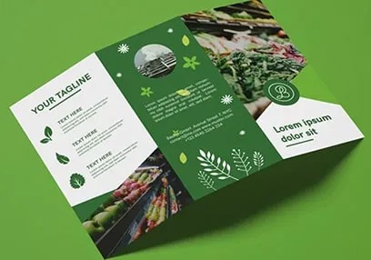
TRI FOLD BROCHURE
-
01 Brochure Concept
-
01 Stock Photo
-
Unlimited Revision
-
Delivery in 01-03 Business Days
-
100% Money Back Guarantee*
4 PAGE BROCHURE
-
01 Four-Pages Brochure Concept
-
01 Stock Photo
-
Unlimited Revision
-
Delivery in 01-03 Business Days
-
100% Money Back Guarantee*
8 PAGE BROCHURE
-
01 Eight-Pages Brochure Concept
-
01 Stock Photo
-
Unlimited Revision
-
Delivery in 01-03 Business Days
-
100% Money Back Guarantee*
FOLDER DESIGN
-
01 Concept
-
01 Stock Photo
-
Unlimited Revision
-
Delivery in 01-03 Business Days
-
100% Money Back Guarantee*
our works
How to Design a Flyer That Gets Attention
Understanding the Strategic Purpose and Target Audience of Your Flyer
Designing a flyer that cuts through everyday advertising noise and generates real customer action requires a clear strategic foundation. Before opening design software or writing headlines, you must define the flyer’s single primary objective—whether that is promoting a retail store opening, advertising a local event, launching a product discount, or driving direct phone inquiries for a home service business. Concurrently, you must analyze your target audience: what visual language, pain points, and promotional incentives will resonate with them? A flyer targeted at young urban professionals requires a completely different visual tone, color palette, and language style than a flyer meant for senior homeowners or enterprise business buyers. Defining your core purpose and audience parameters early ensures every visual asset and word directly supports your campaign goals.
Crafting a Powerful Headline That Hooks Readers Instantly
The headline is the single most critical element of your flyer; it determines whether a recipient keeps reading or tosses the paper into the recycling bin. Browsing consumers typically grant a physical flyer no more than one to two seconds of attention, making a weak, generic header like "Welcome to Our Company" or "Quality Services Provided" a wasted opportunity. Instead, your headline must feature a strong, benefit-driven hook that addresses a specific consumer need or offers an irresistible value proposition. Use bold, high-contrast typography situated prominently near the top of the layout to ensure maximum readability from a distance. By leading with clear benefits—such as "Transform Your Garden This Spring with 20% Off" or "Expert IT Support That Eliminates System Downtime"—you capture interest immediately and entice the reader to explore the rest of your messaging.
Establishing a Clear Visual Hierarchy to Guide the Reader’s Eye
Visual hierarchy is the deliberate arrangement of design elements to guide the reader’s eye through content in a structured, logical sequence. A chaotic, unorganized flyer overwhelms the human brain, causing visual fatigue and reader abandonment. Effective flyer design utilizes size contrast, color emphasis, and spatial arrangement to create a clear reading path, typically starting with a massive hook headline, moving to a striking hero visual, progressing through concise bulleted benefits, and finishing at a prominent Call to Action (CTA). Limit your layout to two complementary typeface families—one bold font for headlines and a clean, legible font for body copy—and maintain consistent margins. By structuring information logically, you ensure that even skimmers absorb your primary value points effortlessly.
Utilizing High-Impact Visuals, Color Psychology, and White Space
Visual imagery and color choices set the emotional tone of your flyer before the reader processes a single sentence of text. High-resolution, professional photography or custom graphics should act as a visual anchor, illustrating the core offer or showing happy customers experiencing your service's results. Avoid low-quality, blurry imagery or overused stock photos that look artificial. Incorporate color psychology strategically: vibrant warm tones like red and orange evoke urgency and energy, cool blues and greens project trust and health, and deep black or gold tones signal high-end luxury. Crucially, do not overcrowd the design; generous use of white space around text blocks and images prevents clutter, increases legibility, and gives your promotional message a clean, professional appearance.
Formulating an Irresistible Offer and a Direct Call to Action (CTA)
A visually stunning flyer that fails to tell the reader exactly what to do next will fail to generate measurable business results. Your flyer must feature an explicit, frictionless Call to Action (CTA) backed by an enticing promotional offer or reason to act promptly. Powerful offers include time-sensitive discounts, free introductory consultations, exclusive coupon codes, or bonus gifts for early responders. Make the next step unmistakable by using large, high-contrast CTA phrasing such as "Call Today for Your Free Quote," "Scan the QR Code to Claim Your 15% Discount," or "Visit Our Website to Reserve Your Ticket." Placing your contact details—phone numbers, physical address, social handles, website URLs, and scannable QR codes—in a clean, highly visible footer block eliminates buying friction and drives swift conversions.
Print Specifications, Proofing Protocols, and Tactical Distribution
The final stage of creating an attention-grabbing flyer involves technical preparation for physical print production and strategic distribution planning. Prepare your digital design files according to professional commercial print standards: use CMYK color mode rather than digital RGB, set resolution to at least 300 DPI (dots per inch) to prevent pixelation, and include a standard 3mm bleed margin along all edges to avoid white borders after trimming. Conduct rigorous proofreading passes with multiple reviewers to catch grammatical errors, incorrect phone numbers, or broken QR code links before submitting files to the printer. Finally, select high-quality paper weights—such as 150 to 250 GSM coated stock—that feel sturdy in hand, and deploy your flyers through targeted door-to-door drops, direct mailings, local retail display partners, or direct event hand-outs for maximum audience engagement.